Systems And Freedom
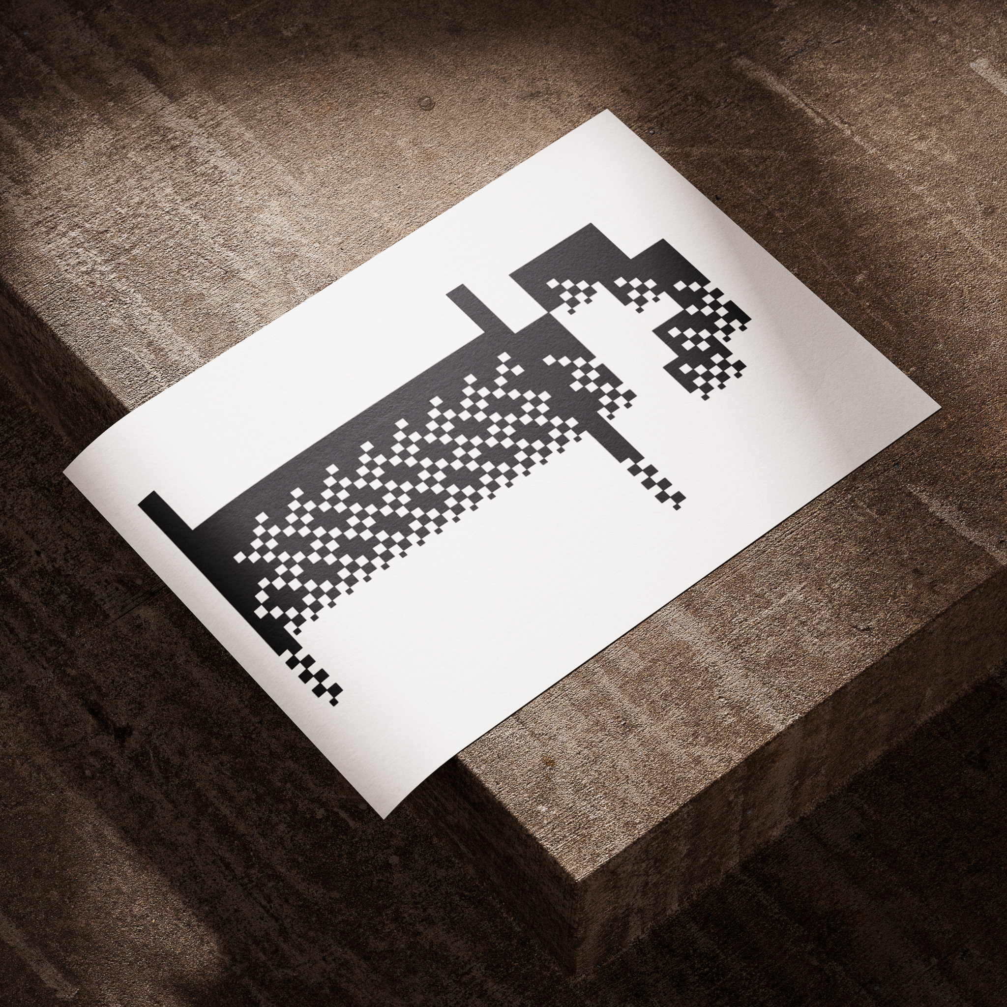
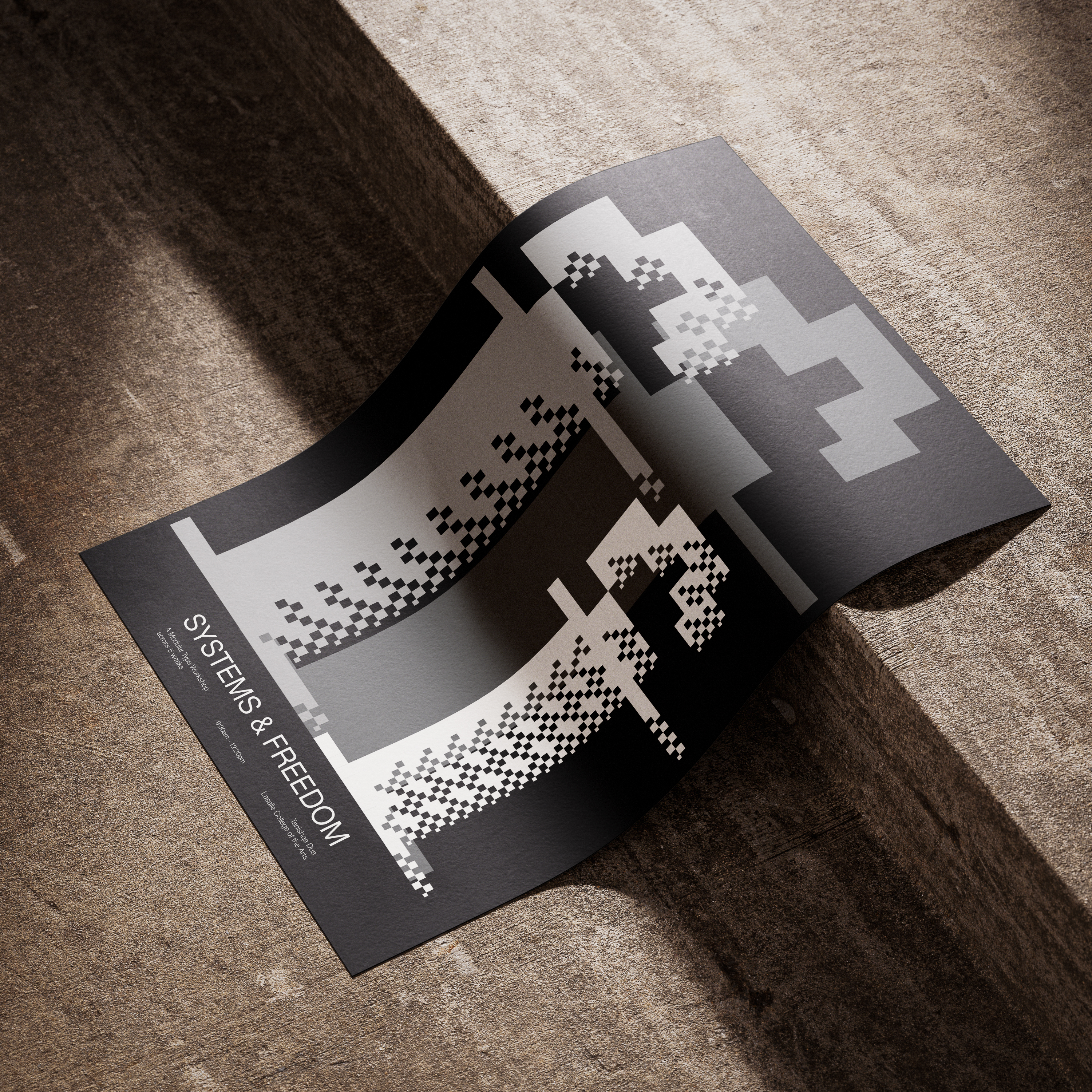
This project delved into an extensive exploration of the letter "F," aiming to stretch the limits of type design and assess its legibility. By deconstructing its composition and adhering solely to grids as a guiding principle, I developed three distinct weights: bold, normal, and light. The result was a visually striking poster that presented all three weights in a monochrome palette. This showcased the nuanced variations achieved through the focused exploration of a single letter.
- Type Design
- Grids
- Typography
- Design Principles
Process